Themen und Haltungen – Teil 2
Kommentiertes Screening und Diskurs am 23.5.2012, 8.30 Uhr, Hörsaal
1st i = Information
Richard Saul Wurman:
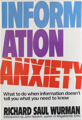
Information anxiety is the black hole between data and knowledge, and it happens when information doesn’t tell us what we want or need to know.
Exactly what is an information architect?
„Someone who enables data to be transformed into understandable information.”
1.1
Richard Saul Wurman: On Cities
1.2
Richard Saul Wurman: The journey begins here
The singular passion in Richard Saul Wurman’s life is making information understandable. Each of his 80 books focuses on some subject or idea that he personally had difficulty understanding. They all stem from his desire to know rather than already knowing, from his ignorance rather than his intelligence, from his inability rather than his ability. His best-selling book Information Anxiety (and a later edition: Information Anxiety 2), serves as an overview of the motivating principles found in his previous works.
download here:
UnderstandingUSA.pdf
Part 1
1.3
TEDxBrooklyn 2010 – Richard Saul Wurman and Kurt Andersen
by TEDx Brooklyn
Spurred by the dance between his curiosity and ignorance, Richard Saul Wurman has sought ways to make the complex clear. He has now written, designed and published 82 books on topics ranging from football to health care to city guides, but he likes to say that they all spring from the same place – his ignorance.
Described by Fortune magazine as an „intellectual hedonist with a hummingbird mind,“ Wurman has been shaped by an epiphany he had as a young man: ignorance and embracing the understanding of what it is like to not understand.
Wurman created the TED conference in 1984, bringing together many of America’s clearest thinkers in the fields of technology, entertainment and design. He continues to co-chair the annual TEDMED meetings.
Part 2
//////////////////////////////////////////////////////////////////////////////////////////////////////////////////
2nd i = Interpretation
Hans Rosling:
Don’t just show the notes, play the music!
Data and information are not boring. The key is to select the appropriate (and accurate) data to support your message. But it also matters how you bring the data alive, giving it context and meaning. One of the masters of displaying data in live talks is Swedish doctor and researcher, Hans Rosling.
2.1
Hans Rosling and the magic washing machine (2011)
2.2
Hans Rosling on global population growth (2010)
2.3
Hans Rosling’s 200 Countries, 200 Years, 4 Minutes (2010)
2.4
Hans Rosling – Der Regisseur der Zahlen
Spiegel Online 28.2.2010
Hans Rosling hat eine Mission. Der Professor für Internationale Gesundheit vom Karolinska-Institut in Stockholm will nicht die Welt verändern, aber den Blick, den die Menschen auf sie haben. Er will, dass sie ihre Vorurteile ablegen. Etwa jenes, dass die Welt sich simpel in arme Entwicklungsländer und reiche Industriestaaten unterteilen ließe. Viele Entwicklungsländer hätten längst große Fortschritte gemacht, sagt der Mediziner. Und er inszeniert seine Botschaft – „Das scheinbar Unmögliche ist möglich” – gern so dramatisch, dass die Zuschauer sie nicht so schnell vergessen.
weiterlesen unter …
spiegel.de/wissenschaft/technik
2.5
Hans Rosling
One of „The 100 Most Influential People in the World”
Time Magazine Apr. 18, 2012
Hans Rosling trained in statistics and medicine and spent years on the front lines of public health in Africa. Yet his greatest impact has come from his stunning renderings of the numbers that characterize the human condition.
Read more:
time.com/time/specials/packages/article
//////////////////////////////////////////////////////////////////////////////////////////////////////////////////
3rd i = Intervention
Die Yes Men regeln die Welt (2009)
Sometimes it takes a lie to expose the truth.
„At an international conference in Austria, about the importance of free markets, we [posing as representatives of The World Trade Organization] said we have a giant free market, it’s called democracy, and the only problem is that corporations can’t buy and sell votes, we want to open a free market and democracy by allowing people to sell their votes to the highest bidder. The audience of highly educated lawyers and government officials said, „You’re right. Great idea. Let’s implement it. Let’s figure out how to do it.“ And they just accepted it because it stayed within their logic of the free market.”
The Yes Men
//////////////////////////////////////////////////////////////////////////////////////////////////////////////////
Appendix
Journalism in the Age of Data
by Geoff McGhee
Journalists are coping with the rising information flood by borrowing data visualization techniques from computer scientists, researchers and artists. Some newsrooms are already beginning to retool their staffs and systems to prepare for a future in which data becomes a medium. But how do we communicate with data, how can traditional narratives be fused with sophisticated, interactive information displays? Watch the full version with annotations and links at datajournalism.stanford.edu. Produced during a 2009-2010 John S. Knight Journalism Fellowship at Stanford University.
Information aesthetics. Where form follows data.
Inspired by Lev Manovich’s definition of „information aesthetics“, this weblog explores the symbiotic relationship between creative design and the field of information visualization. More specifically, it collects projects that represent data or information in original or intriguing ways.
Siehe auch …
infosthetics.com/archives/movie
Beispiele aus infosthetics.com
1
Titanic – for BBC History
by After the Flood
We worked with the BBC to make this video about the Titanic. It is for BBC History and serves to introduce people to the basics of the story. We think it is important to compliment the material for enthusiasts with something for those new to the subject.
2
The Stars – for BBC Science and Nature
by After the Flood
This is a format development project for BBC Knowledge and Learning. After the Flood were asked to look at how complex, information rich subjects can be told well in short videos.
3
Twitter Dots: Mapping all Tweets for a specific Keyword
Twitter Dots [twitterdots.com] translates individual tweets as simple dots on a geographical world map. It is as simple as that. The actual keyword changes each day. Still interesting to observe how a timeline animation shows some people still tweet „Good Morning“ in the late evening… That or the geographical location might be off for a lot of people (e.g. overseas holidays?).
4
A Year in Snapshots: Revealing where Photos are Taken in the World
Mobile travel guide provider Triposo has a natural interest in location-based data, as its free travel guides are automatically generated from a large collection of open datasets. To show off their expertise, they have recently created „A Year Long Snapshots around the World“ [triposo.com], a short movie that reveals the exact locations in the world where pictures were taken, and that for each day of the year. In short, the movie shows a world map in which pixels light up according to the relative amount of pictures taken. As the resulting animation is too dense and fast to make sense of, they have provided a series of snapshots to highlight some remarkable trends and outliers. In particular, they are requesting advice for some hugely popular event on 30 November that is reflected by an immense amount of photos taken everywhere in the world (although they suspect a default camera setting to be the real reason).
5
Wireless in the world 2
This new urban landscape is no longer predicated solely on architecture and urbanism. These disciplines now embrace emerging methodologies that bend the physical with new measures, representations and maps of urban dynamics such as traffic or mobile phone flows. Representations of usage patterns and mapping the life of the city amplify our collective awareness of the urban environment as a living organism. These soft and invisible architectures fashion sentient and reactive environments.
6
Touch: Design practice & experiments in film
7
Immaterials: Light painting WiFi
This project explores the invisible terrain of WiFi networks in urban spaces by light painting signal strength in long-exposure photographs. A four-metre long measuring rod with 80 points of light reveals cross-sections through WiFi networks using a photographic technique called light-painting.

